packaging Design for Food Allergy Prevention Drops
The Project
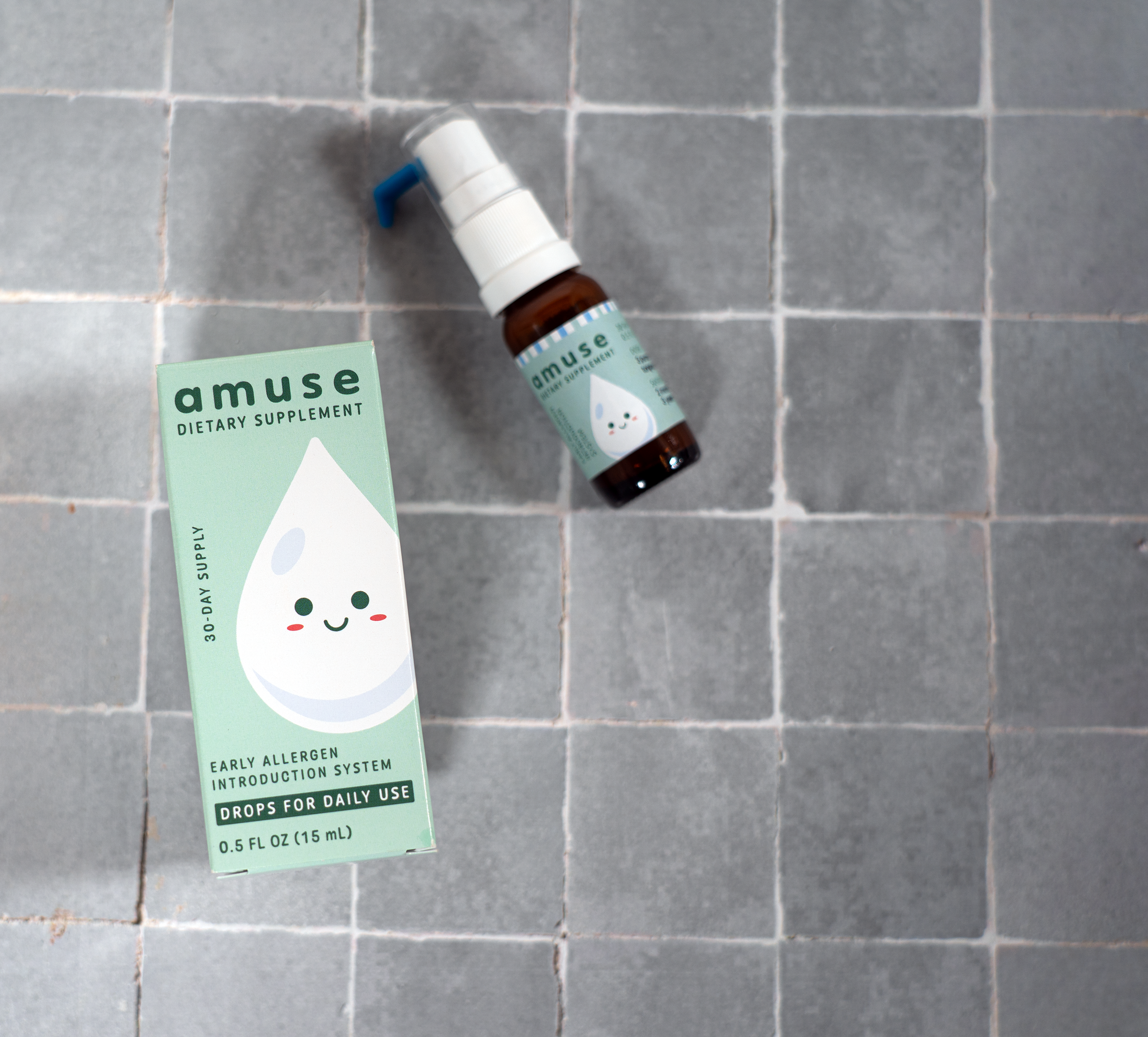
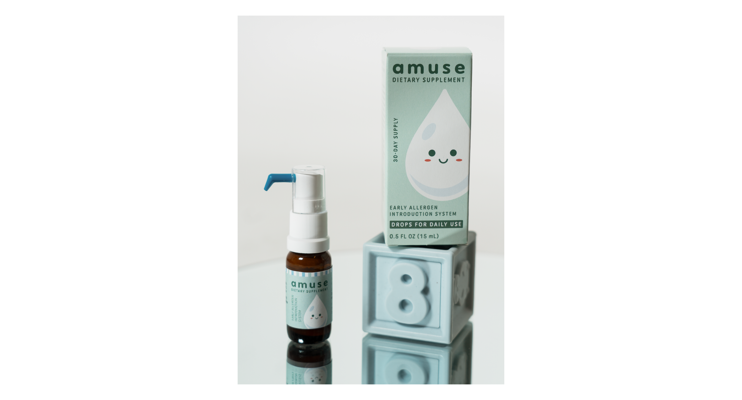
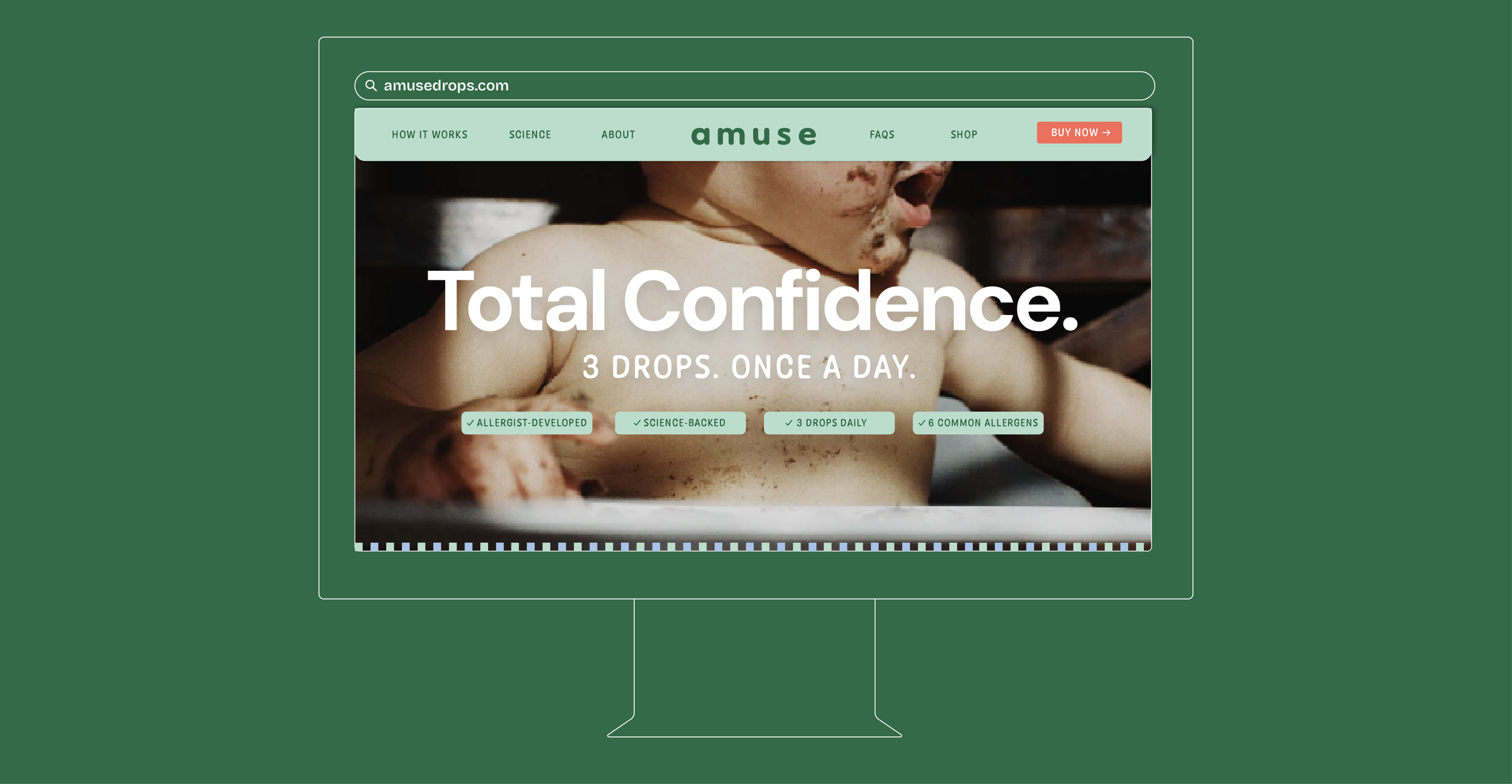
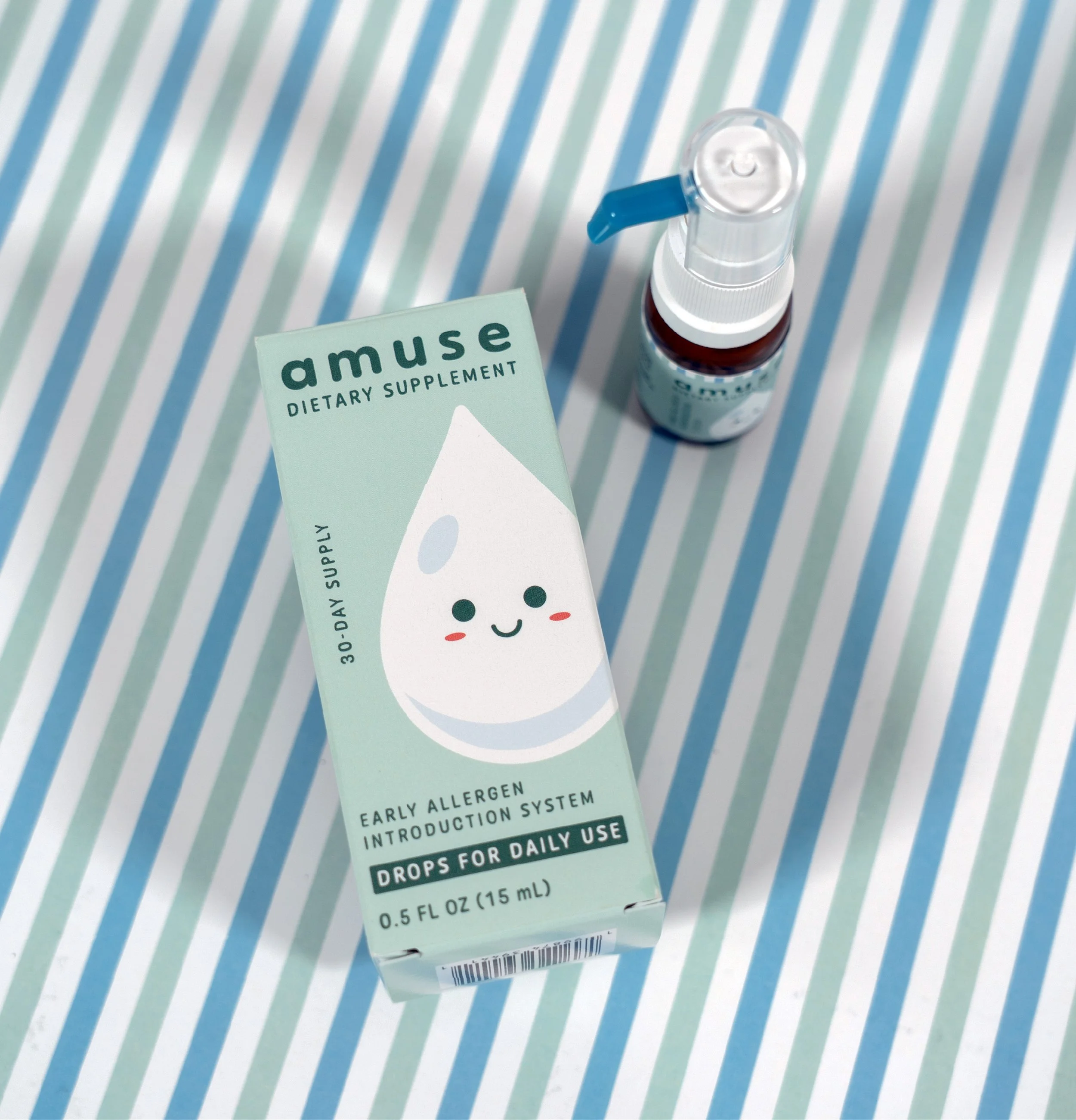
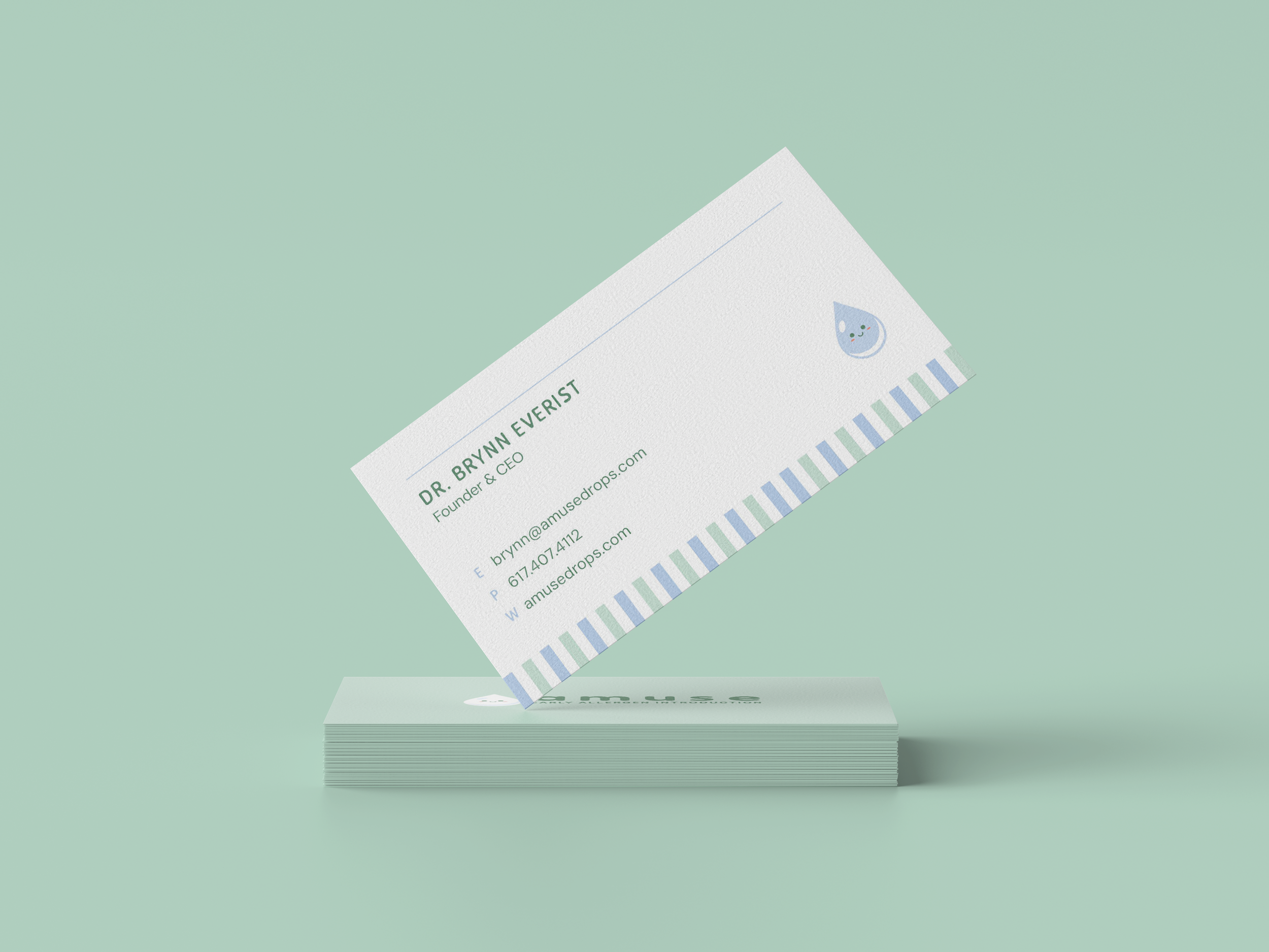
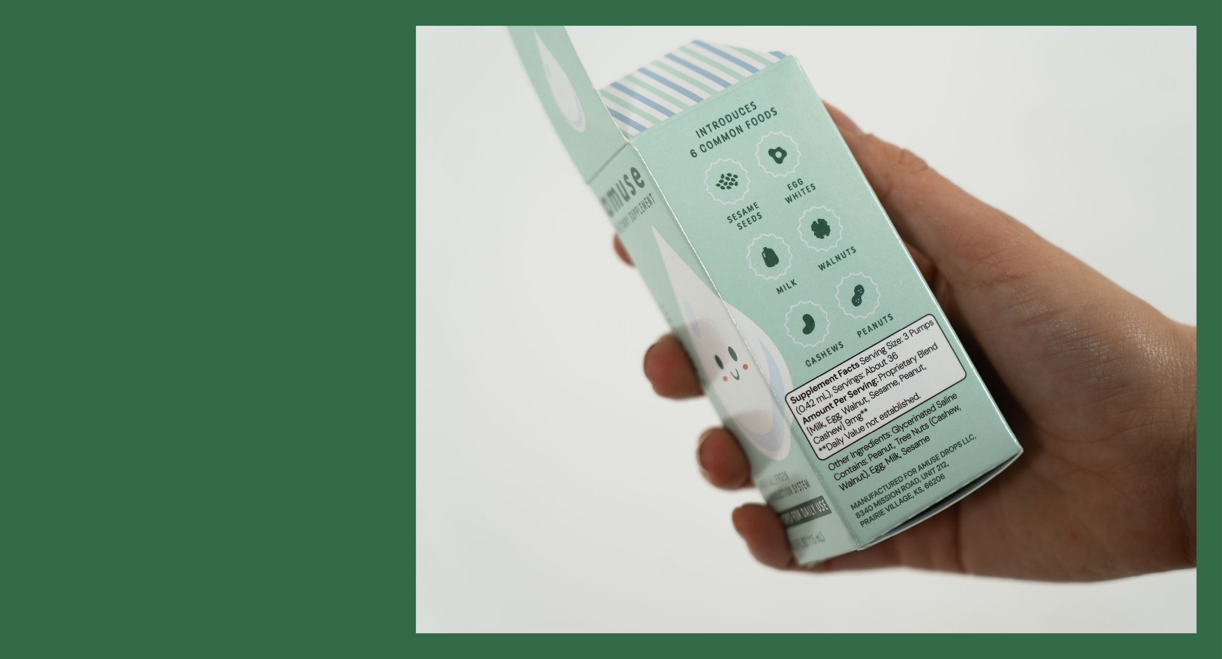
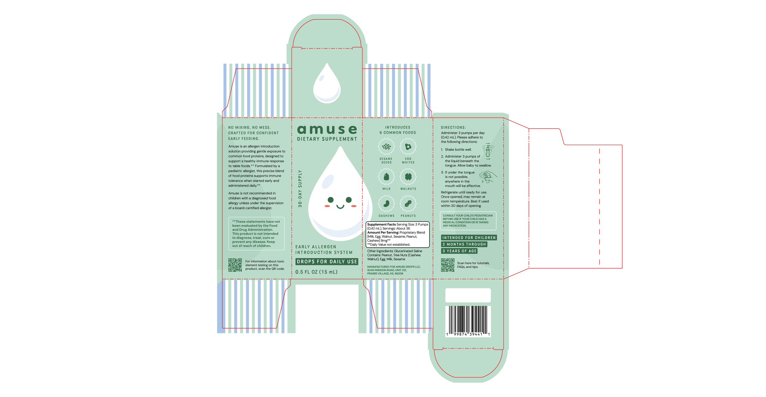
Great branding doesn’t just explain a product, it gives people the confidence to try it. For Amuse Drops and Dr. Brynn Everist, the challenge was balancing medical credibility with warmth by creating packaging that felt both science-backed and approachable. Clean typography, a mint green color palette, drop illustration, that subtly nods to healthcare paired with playful accent colors that feel bright make it feel kid-friendly. I created an identity and packaging system that turns a breakthrough in infant nutrition into an approachable, trustworthy experience, making early allergen introduction feel as simple as a daily routine.
Agency: DMH / Lead Designer & Art Director: Erica Gonzales
Client: Prairie Allergy, Dr. Brynn Everist



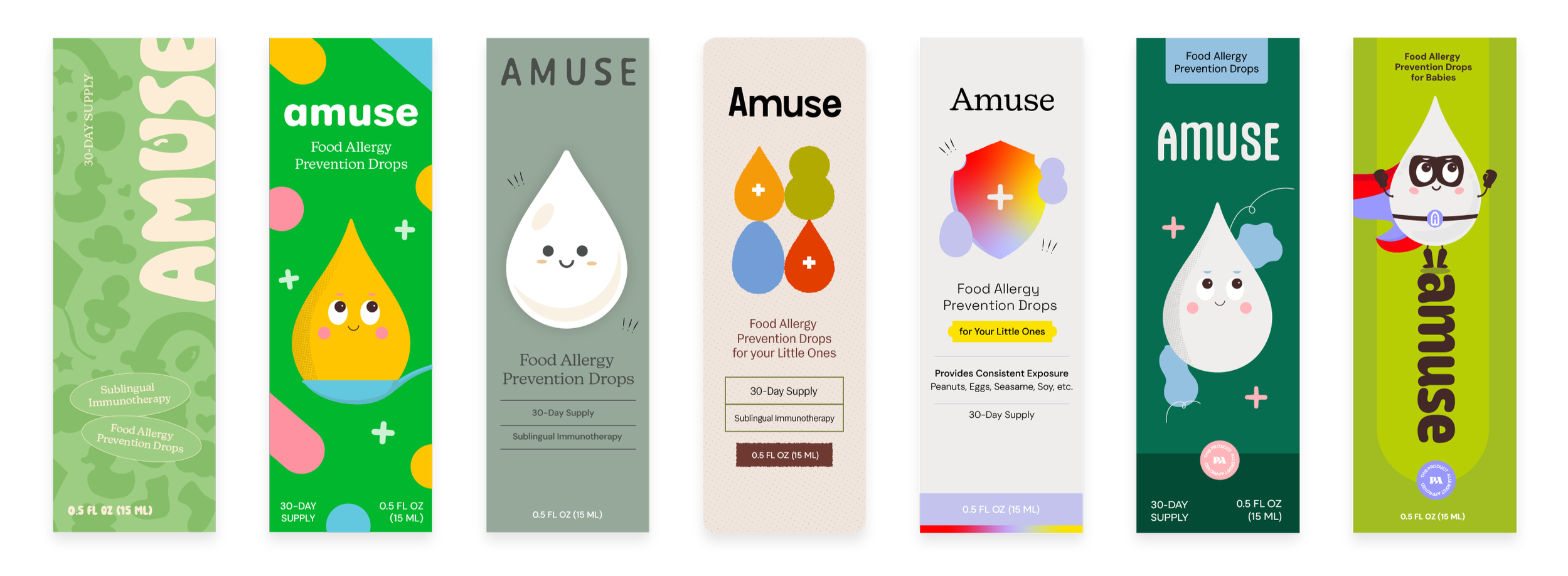
Dead Concepts & Sketches